| Lower Troposphere - UAH |

Fig 1.
Source: The National Space Science & Technology Center at U of Alabama at Huntsville. Temperature sampled monthly. https://www.nsstc.uah.edu/data/msu/v6.0/tlt/uahncdc_lt_6.0.txt
Note that there is an extended pause in warming from about 2000-2015, followed by greatly accelerated warming. This extended pause is not found in surface measurements.
This chart is obsolete and has been corrected. For the graph of the corrected data, see here.
One thing that I don't understand about this data, is that the a temperature of zero on the Y-axis is about the temperature in the year 2000, which is quite a bit warmer than when the satellite data began, and even warmer relative to the average temperature from 1850-1900, which is noramlly the temperature that climate scientists like to refer to as "zero".
|
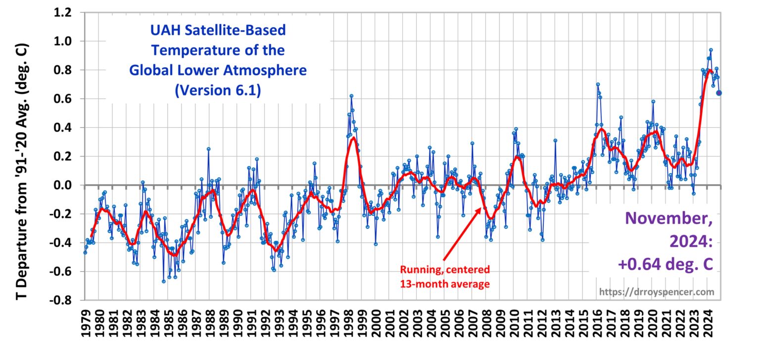
Climate Skeptic Roy Spencer's Chart of the Same Data |
Here in Fig 2 is a plot made by the climate skeptic Roy Spencer from what he says is the same UAH satellite data as Fig 1 above. The red curves look pretty similar in both plots.
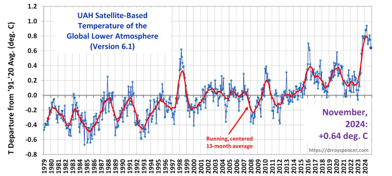
Fig 2. Click image to enlarge
In Fig 2, Spencer seems to be doing everything he can to drown out the signal with noise. His red curve is a 13-month running average (the red curve in Fig 1 is a 12-month running average) and the two red curves, being from the same data, appear to match. It's clear in Fig 1 that the red curve is very noisy and not very meaningful when you're trying to measure climate change trends, you really have to look at the green 60-month curve to observe the trend. In addition, Spencer plots all these very noisy, frequent, blue datapoints meaning heaven-knows-what and they're simply a distraction.
Spencer claims that the temperature in May 2023 is "+0.37 deg C", but that's not relative to the much cooler 1850-1900 average, it's relative to the zero for the satellite data, which seems to be the temperature in about the year 2000. In addition, taking a one-month measurement is so noisy it's completely meaningless when you're trying to observe global warming trends.
Before we had satellite data plots with 5-year running averages on them on this website, I had a climate skeptic show me Roy Spencer's plot and claim, with a straight face, that he could not see any warming trend in it. Even though Spencer is working pretty hard to obscure the reality with noise, it's very clear that, in his plot, the red curve is below zero on the left end of the graph and above it on the right end of the graph -- a warming trend.
|
Is
Climate Change Real? Home |