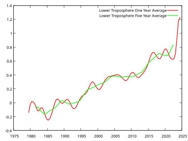
There is a separate satellite data set offered
by the University of Alabama at Huntsville that shows a very
different chart, particularly it shows a 17-year pause in
warming starting around 1998. There are believed to
be errors in that data as it was not accounting for the decay
or the satellites' orbit over time. There was a
paper
published about that and the corrections to the data that
were made to produce this REMSS chart.
The UAH temperature plot can be seen
here
. Climate skeptic Roy Spencer's plot of the UAH satellite
temperature data is
here.